PBR is not actually the key to good material work. It’s all well and good to understand the ins and outs of your PBR software of choice, but really good material work starts with simply taking lots and lots of reference photos. I think a lot of artists assume they can just google “rust texture” and “leather texture seamless” and be on their way to making the most realistic, weathered leather corset the world has ever seen, but this is not the case. The sooner you start taking your own reference photos rather than downloading other peoples, the better off you’ll be. That isn’t to say you need ten million photographs of every material under the sun. A small number of photographs of a single material, taken in lots of different lighting conditions, is worth more than a thousand 8k textures of the same material downloaded online. For example, I have one photograph of a brass doorknob which I took in the mid-afternoon. In the light, the doorknob appears golden, but in the shadows it appears nearly purple. This one photograph has taught me more about how to make realistic brass materials than any texture I could download.
If you shoot them yourself, you’ll start to pay attention to things that get washed over or removed in stock photos. The tiny differences in gloss of polished chrome depending on the traces of oil from finger prints. The differences in how concrete decays on the top of a step compared to the riser. The sheen of plastics that only show up at certain angles. All of these are the result of some real process of weathering and use. And if you take the photo yourself, (even with a smartphone) it means more to you than if you just find one online.
Keeping it organized is as crucial as collecting. The best systems don’t stop at folders named “metals” and “woods.” They’re more oriented around the function and occasion, like “values that change with the angle of view,” “different materials with subsurface scatter,” “faded finishes with anisotropic scratch direction.” Experienced artists also typically keep a little text comment on each photo, describing the lighting, time of day, temperature of the material if applicable, and personal impression of the material. It turns a photo into a study, and when you’re trying to recreate it months later in a completely different situation, the extra context becomes invaluable.
But the game-changer comes when you use your library as your go-to resource instead of a go-to backup. Whenever you have to make a new material, you no longer go straight to a material browser but start searching for something similar in your own library first. That requires you to actually read the material and figure out what’s important, what can be skipped or what can be done for the sake of art. And after a while, you develop a mental texture palette which enables you to create materials which are completely fictional yet somehow still photo-real. Those materials will be very much “you”, very much like a style. Materials which not only work well but also “feel” right, like they’re yours.
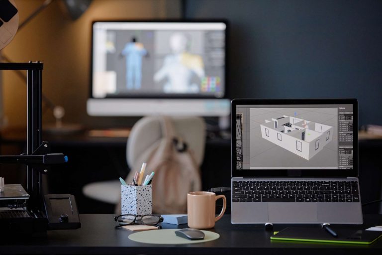
When it comes to software, the allure is easy to understand. We can generate nearly limitless diversity with a few mouse clicks. It’s also why having a personal reference library, as if you were a maker of parchment scrolls, can be an incredibly powerful practice. When it comes to material art, there’s nothing quite like a reference library for being able to develop a unique style. It’s never the artists with the most shortcuts who win annual awards, but the artists who have done the most looking, recording, and translating. Reference is not just a repository of images, it’s a record of your ongoing interpretation of the real world, and the greatest investment you can make as a material artist.